
A Journey Through Visual Design Workshops: How We Shaped a New Visual Language for Our Client’s Success
Just a month ago, our design team was running a design sprint to develop a new information architecture. At the same time, we aimed to establish a new visual language for the product.
Setting Expactations
The first thing we needed to do was understand our client’s expectations for the visual language. So, my co-designer Ebru Namaldi and I decided to prepare a Visual Design Workshop to gain insights into the graphical user interface. We made it happen, and now, I’d like to share that journey with you.
What makes design truly beautiful is the process behind it, and design thinking plays a huge role in that. It’s incredibly efficient when used at the right times — whether during kickoff, ideation, feature prioritization, or goal setting. It’s also a great opportunity to solve design-related problems alongside stakeholders through a series of structured exercises.
How We Started
We felt confident about how we were going to structure the workshop and what we wanted to achieve by the end of it.
Our plan consisted of three main steps:
1. Benchmarking (exploring what’s already in the market)
2. Sitemap Review (reviewing what we’ve done so far)
3. Clarifying Expectations (defining the future direction of the product)
With this roadmap in mind, we went through all the design thinking activities we had done in the past, aiming to match them with the goals of our workshop. It was both fun and challenging to select the right activities for our visual language workshop. After much consideration and rehearsal, we chose Rose, Bud, Thorn, The Love/Breakup Letter and Design Inception as our final lineup.
The Activities
Here’s a brief overview of the activities and their purpose:
1. Rose, Thorn, Bud
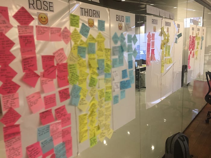
We selected this activity for our benchmarking session. It’s a fantastic tool designed to explore what’s working, what isn’t, and where opportunities lie. We divided the board into three sections: Rose (what’s working), Thorn (what’s not), and Bud (opportunities). Participants used sticky notes to categorize their insights into three different boards: dashboard, navigation, and style.
2. The Love/Breakup Letter
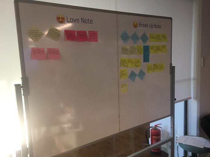
For the sitemap review, we opted for the Love/Breakup Letter activity. This is a fun exercise where participants write emotional “love” or “breakup” letters to identify the positive and negative aspects of a product. In our case, we used notes instead of letters in order to get clear “likes” and “don’t likes”, which worked perfectly for evaluating the visual language.
3. Design Inception
In the final session, we used the Design Inception activity to collect participants’ expectations and requests for the product’s visual language. This activity is one of my favorites because it gives you purposeful keywords related to space, color, shape, and movement, which you can later validate during user testing by asking, “How did the visual design make you feel?”

Preparing for the Workshop
Once the activities were aligned with our agenda, we started preparing for the big day. We planned two sessions with a 15-minute break in between, and about 12 participants were expected to join.
For the first session, we selected five products from the market and analyzed them in terms of dashboard, navigation, and visual language design. A booklet with this content was also prepared for participants. We then set up boards for the Rose, Thorn, Bud activity, as well as a board with lovely emojis on it for Love/Breakup Notes, and printed templates for Design Inception.
The Workshop Day
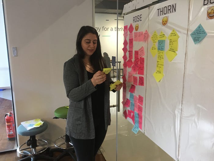
The day after preparations, the workshop began. My colleague and I moderated it in our office. The first session kicked off with the benchmarking activity, where participants enthusiastically reviewed the selected products and wrote their thoughts on sticky notes. We grouped the notes and read them aloud, finalizing the first activity.
After a short break, we moved on to the sitemap review with Love/Breakup Notes. I wish I could share some of the creative entries we received! Not surprisingly, the “breakup” notes outnumbered the “love” ones, making it the most entertaining part of the workshop. Finally, we wrapped up with the Design Inception activity, where we gathered essential keywords for the future design.
Post Workshop Insight
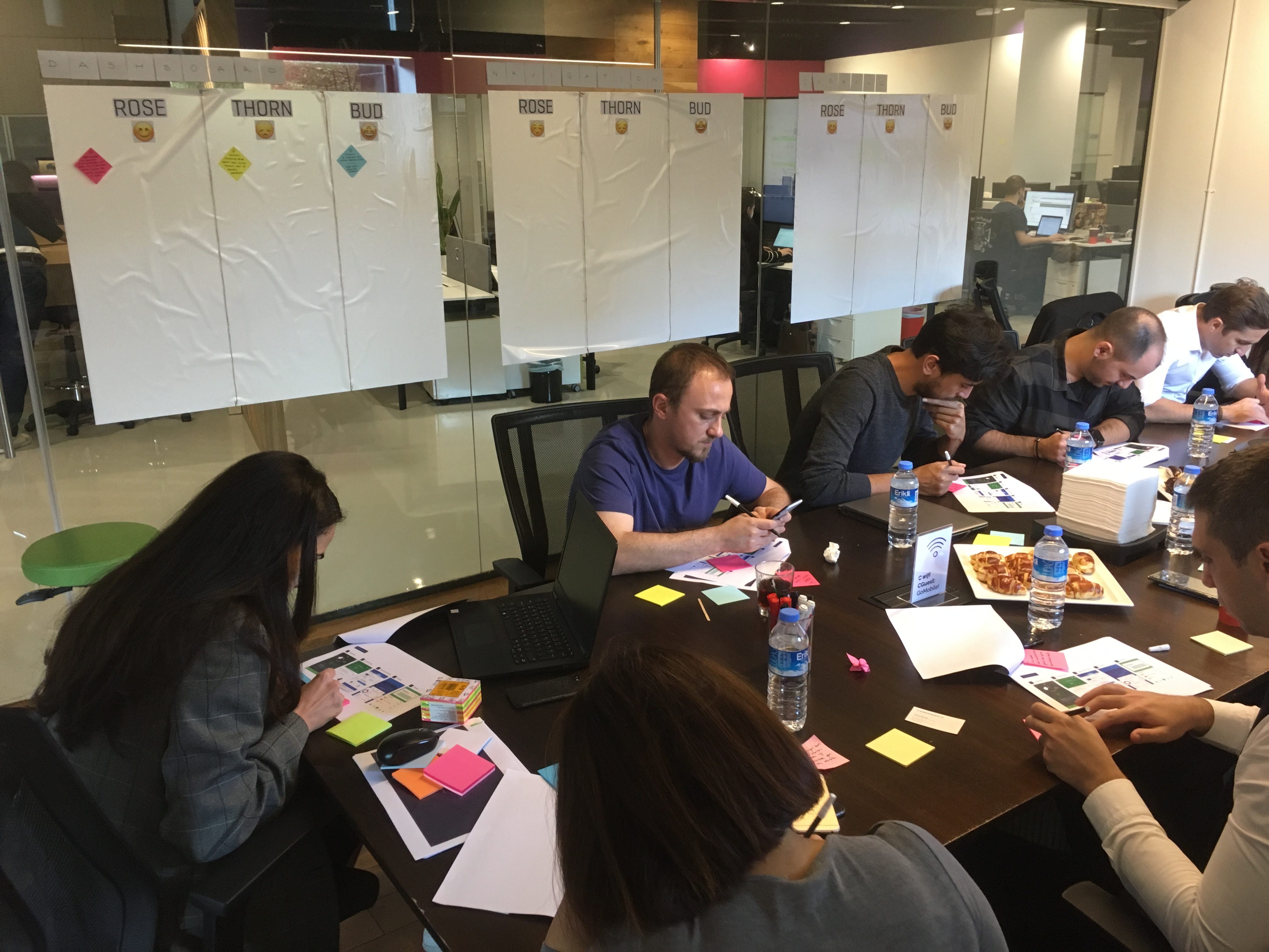
The workshop lasted about three and a half hours, with 12 active participants. We gathered valuable insights, encouraging participants to share what they liked and disliked about both the market and the existing product. We also identified their expectations for the new visual language.
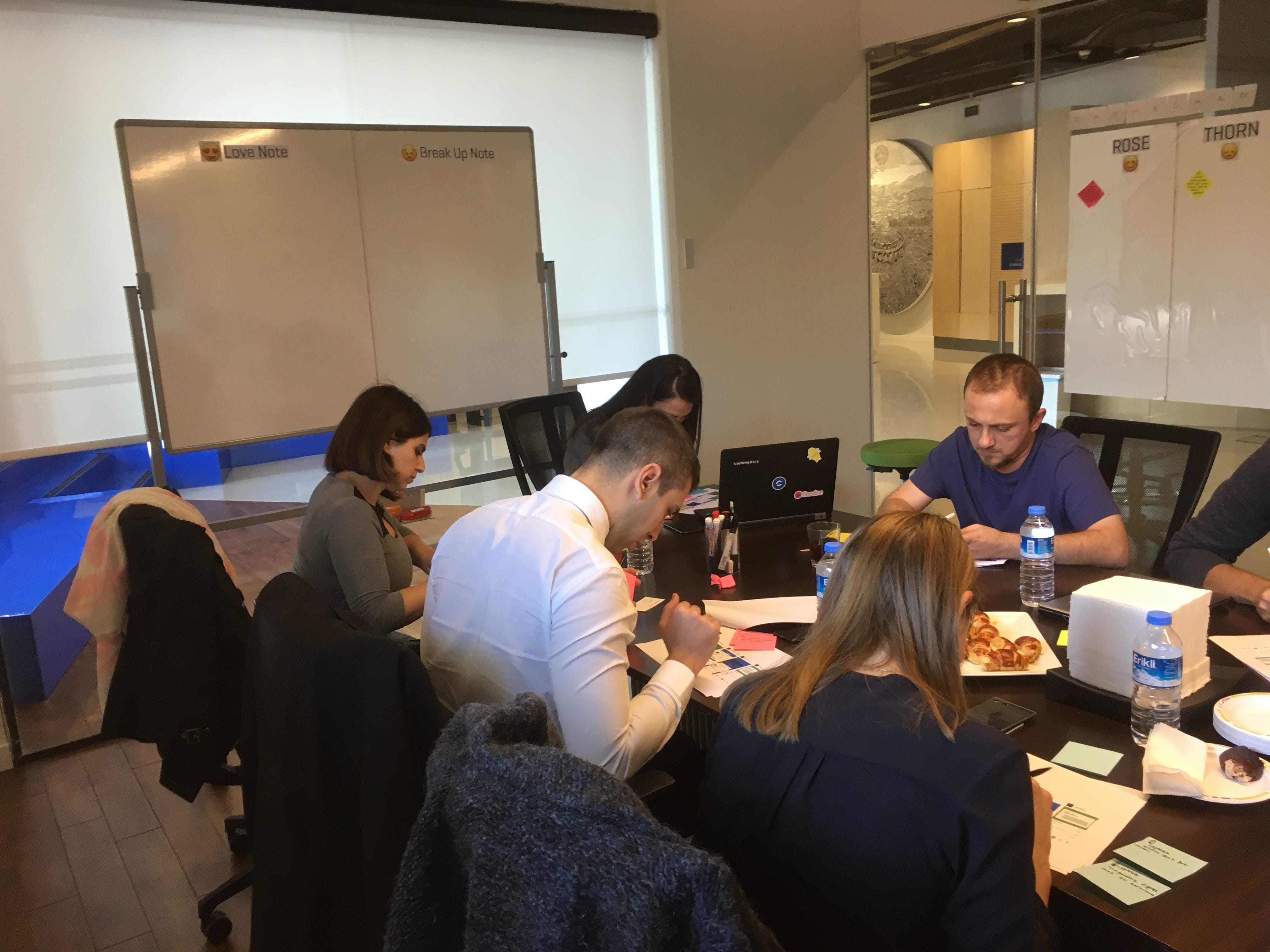
But, was it over? Nope.
After the workshop, we synthesized the findings from the first two activities and grouped them under four main categories:
1. Layout & Hierarchy
2. Color & Typography
3. Visual Elements
4. Tone of Voice
This categorization helped us better understand the team’s feedback and design direction.
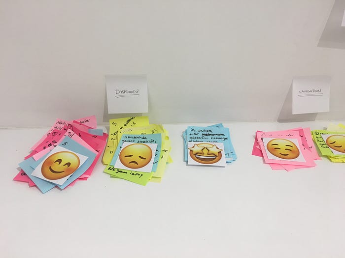
As for the keywords from the Design Inception activity, we grouped them into two categories: prominent (used multiple times) and original (used once or twice). This method gave us clearer insights into the overall mood and feel participants were aiming for.
In the end, a detailed report was prepared, which will guide us through the visual design process.
Conduct Your Own Workshop
Planning and conducting design workshops can be challenging, especially for visual language. But with the right participants and a well-structured agenda, these workshops can play a crucial role in shaping your design processes.
